
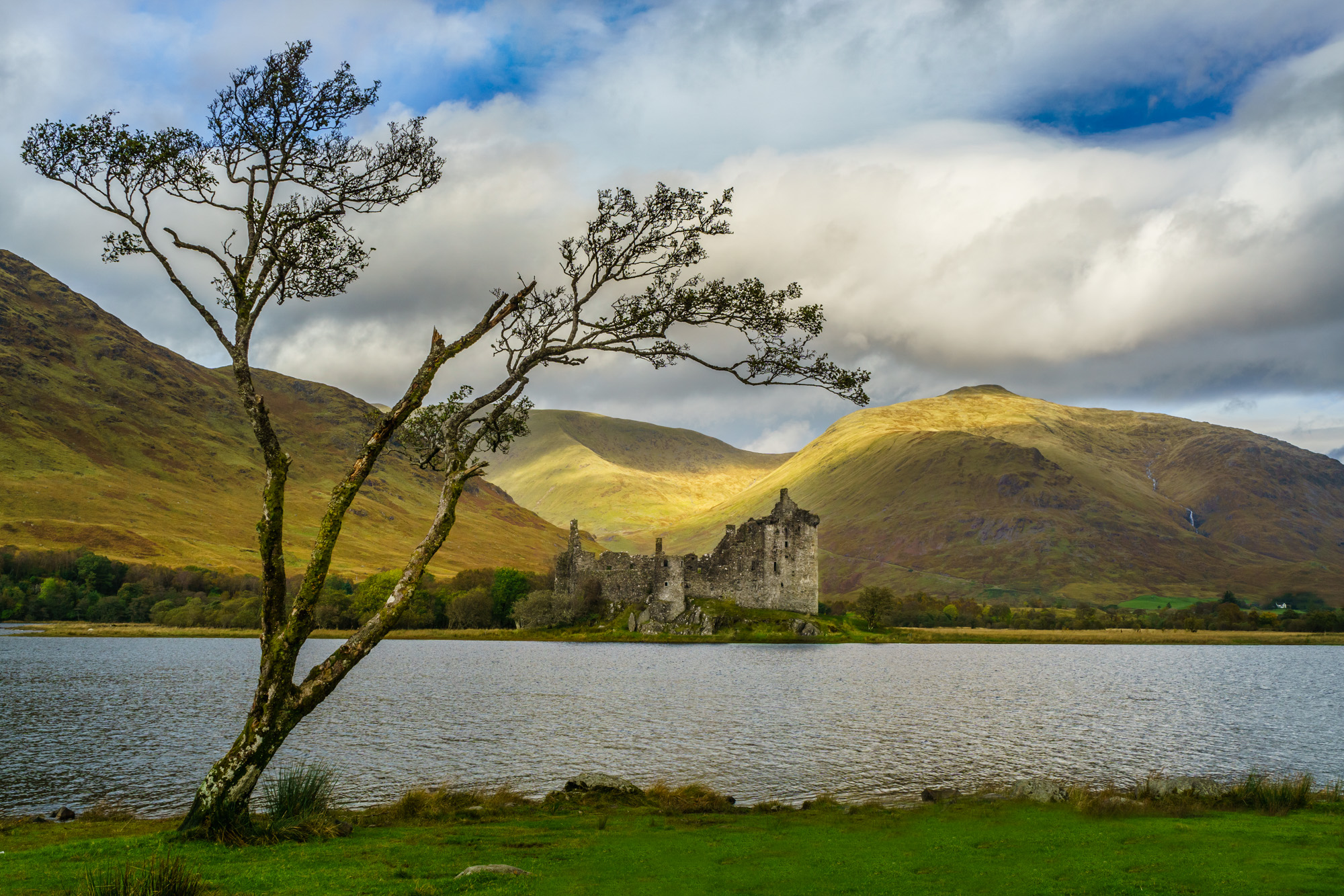
I remember standing in front of Kilchurn Castle in Scotland for the first time. The sky was alive with clouds, the light was dancing on the hills, the waters of Loch Awe sparkled in the foreground. So many beautiful things happening at once, and yet… when I lifted my camera, something felt off. My eyes saw magic, but my photo didn’t.
This is the constant challenge as photographers: figuring out how to create compositions that convey the feeling of a place. Making an image isn’t about capturing everything in front of you. It’s about deciding what is important and finding the details, shapes, or structures that will bring order and impact to the scene. Sometimes that means leaving things out. Other times it means noticing what you can include to give the image strength. It’s about choosing what belongs in the frame with intention.
Making an image isn’t about capturing everything – it’s about choosing what belongs.
The world is full of visual clues to guide your photographer’s eye if you slow down enough to notice them. Clues about how to arrange your frame, guide a viewer’s eye, and turn a snapshot into fine art. These clues are the elements of design, the building blocks of composition, and once you start looking for them, you’ll see them everywhere.
Let me walk you through a few of the ones I return to again and again.
Lines
Lines are like invisible arrows. They tell the viewer where to look and guide how the eye travels through an image. A powerful element of graphic design, different kinds of lines have very different effects.
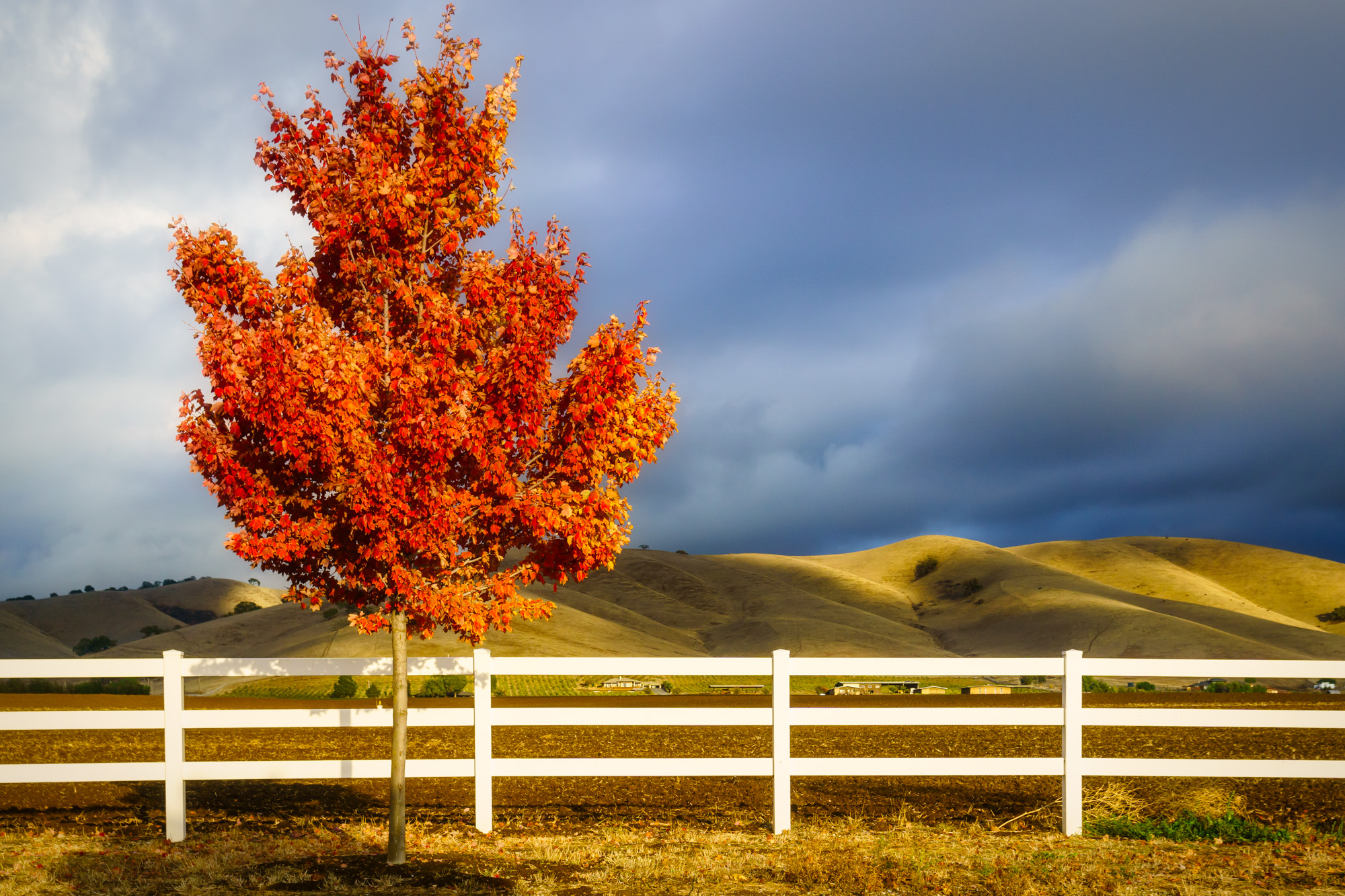
You’ll find horizontal lines almost everywhere: like stairs, fences, piers, even lines in the sand. They carry a sense of calm, the way a still landscape makes you exhale.
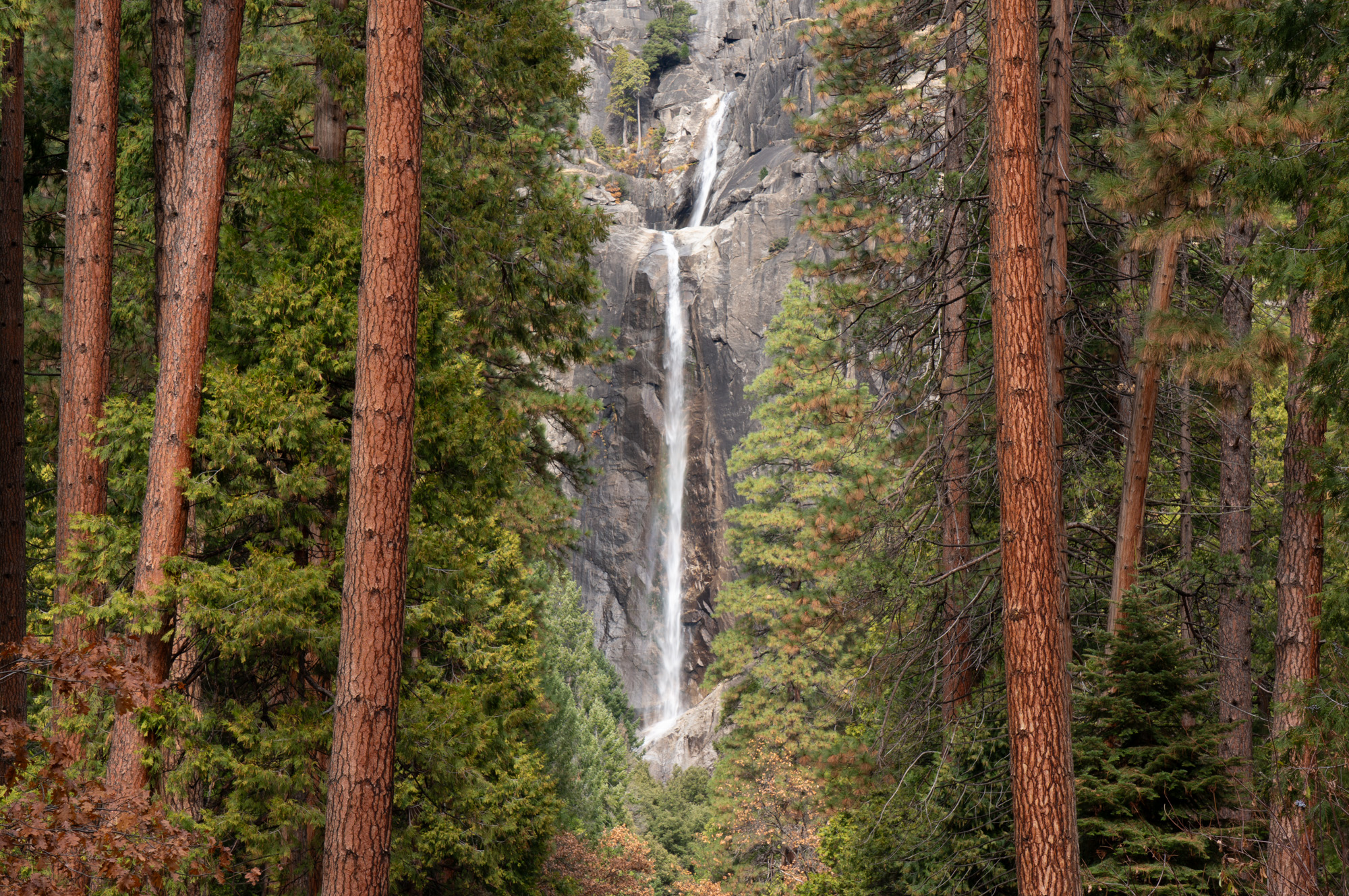
Vertical lines, on the other hand, feel different. They rise up with a kind of strength. Think of skyscrapers pushing into the sky, or tall trees standing like pillars in a forest. Even a waterfall plunging straight down can give that same impression of power and grandeur.
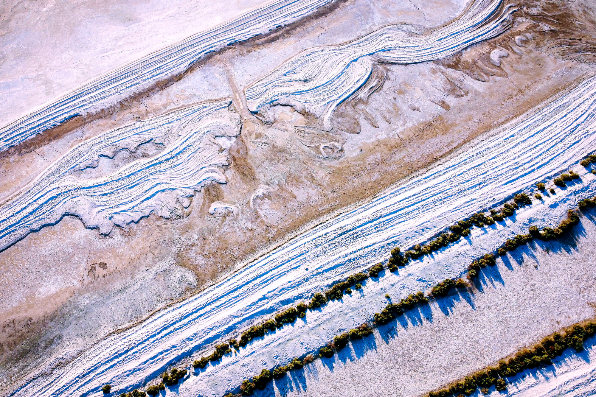
Diagonal lines, unlike the steadiness of horizontal or vertical lines, a diagonal adds energy and movement. It’s the kind of visual force that makes an image come alive.
And then there are curves that lead the eye through the frame in c-curves, s-curves, circles, spirals or arches. They are very pleasing to the eye like a river winding its way home.
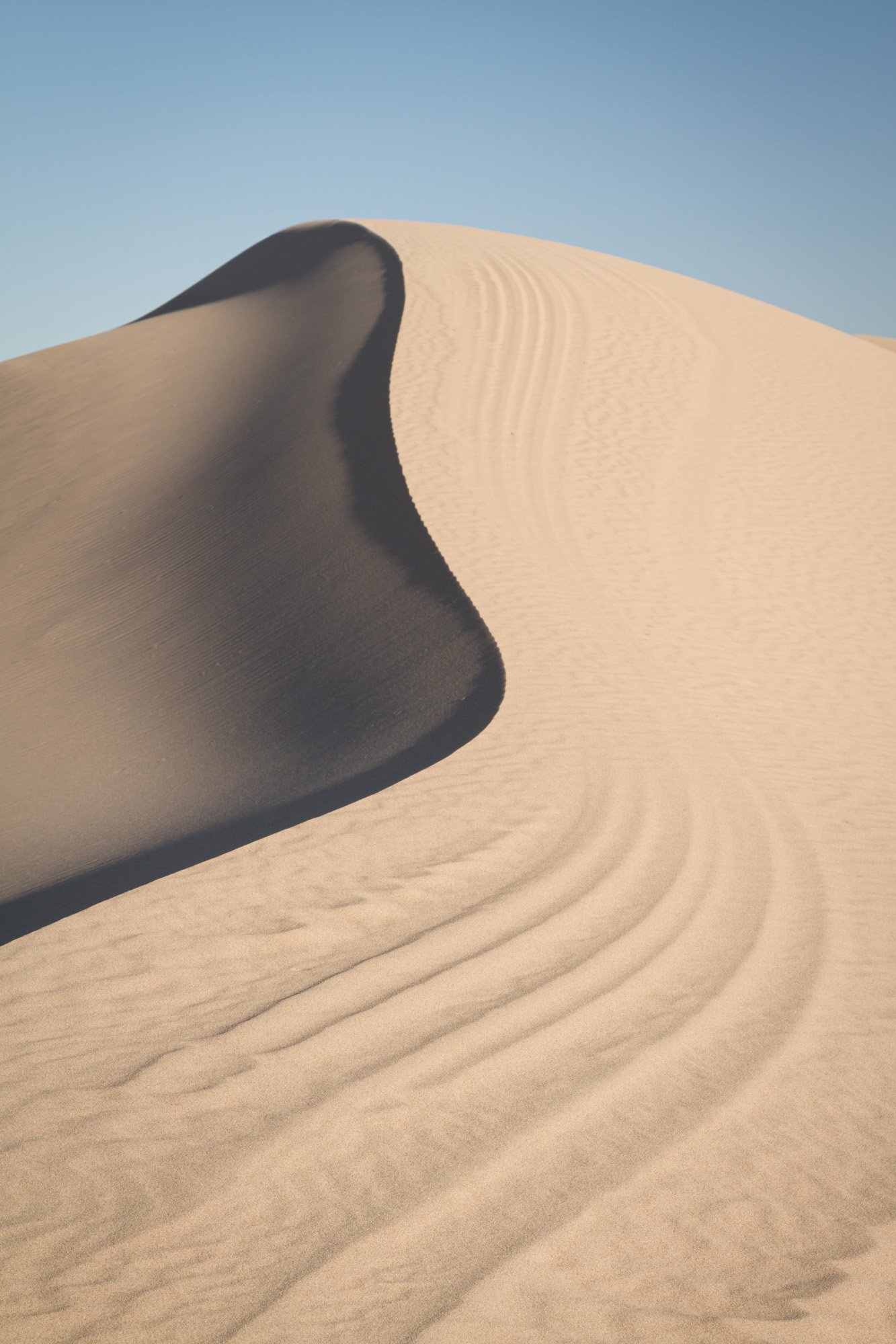
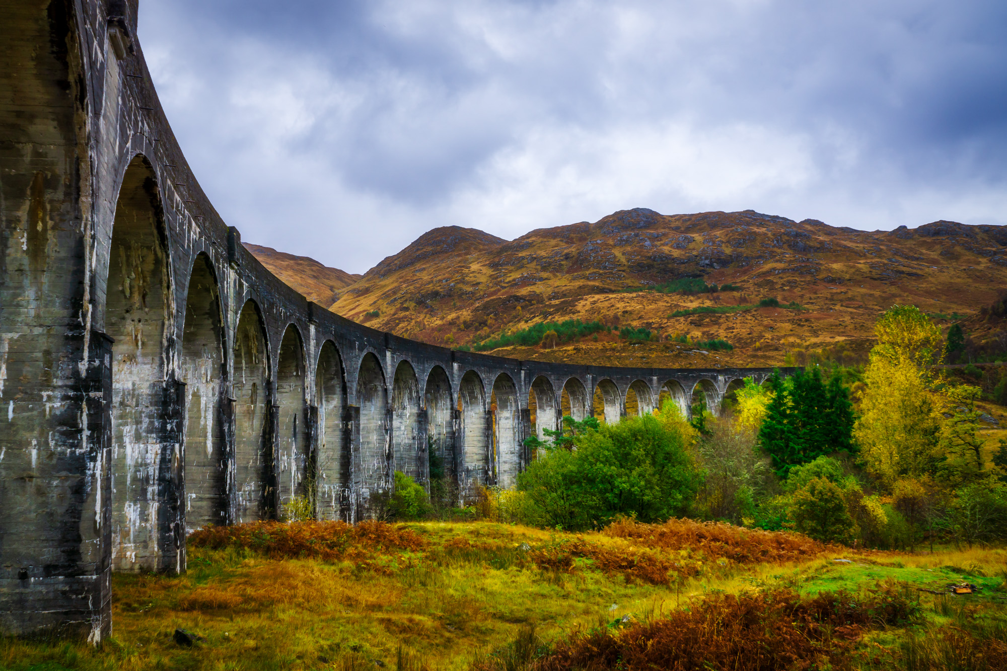
Sometimes you’ll even find leading lines that point the way to your subject.
Colour
If lines guide the eye, colour stirs the heart. It sets the tone, mood, and feeling of a photograph.
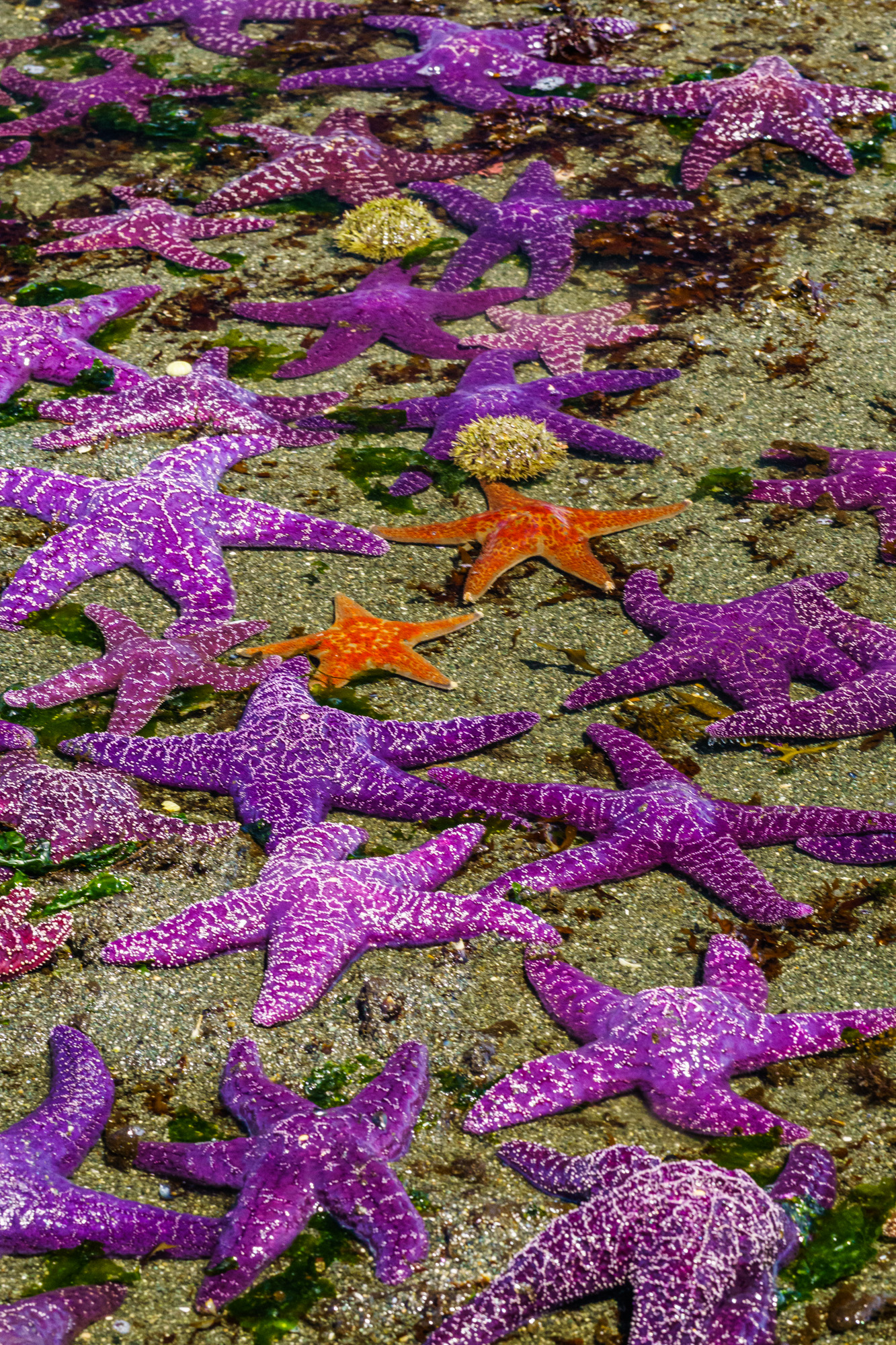
Think about how calming a sea of blues feels, or how a splash of orange instantly demands attention. Some of the strongest images come from pairing opposites. Try looking for complementary colours: the cool quiet of blue with the fiery heat of orange, the play between purple and yellow, or red and green. These combinations make the image hum.
When you’re out with your camera, try noticing not just what you’re photographing, but what colours are speaking the loudest.
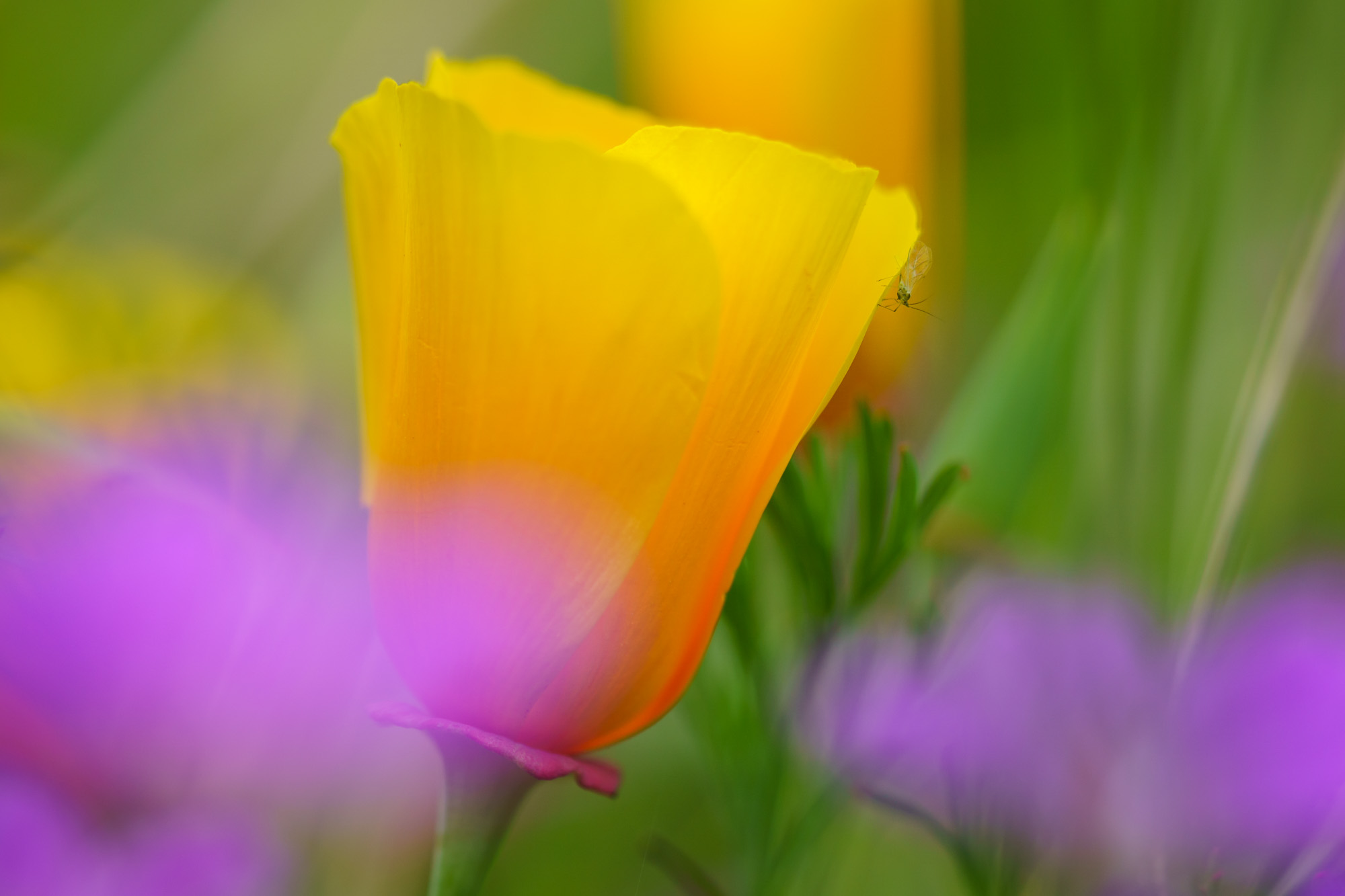
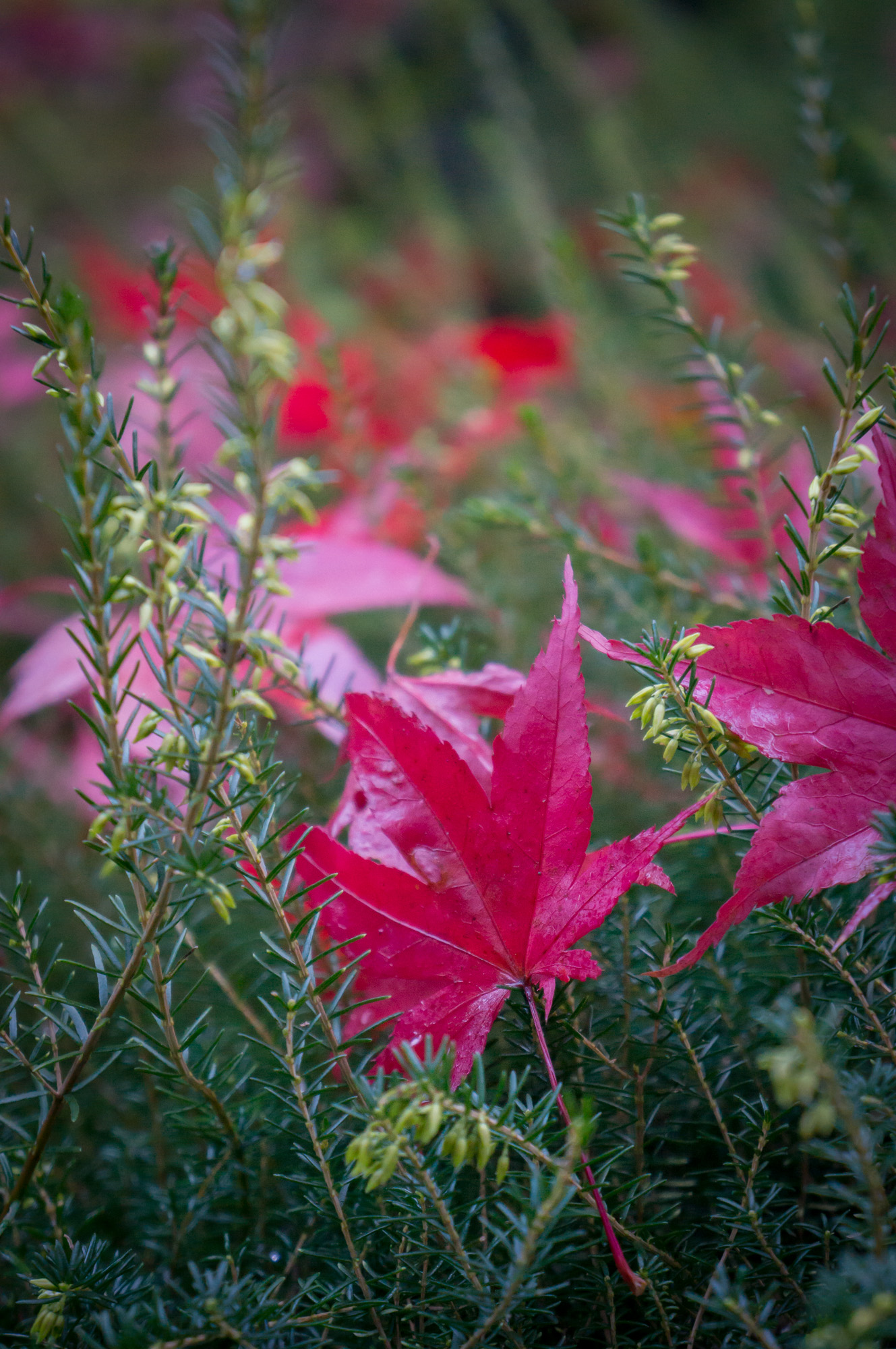
Complementary colours, like blue and orange or red and green, create instant impact.
Patterns
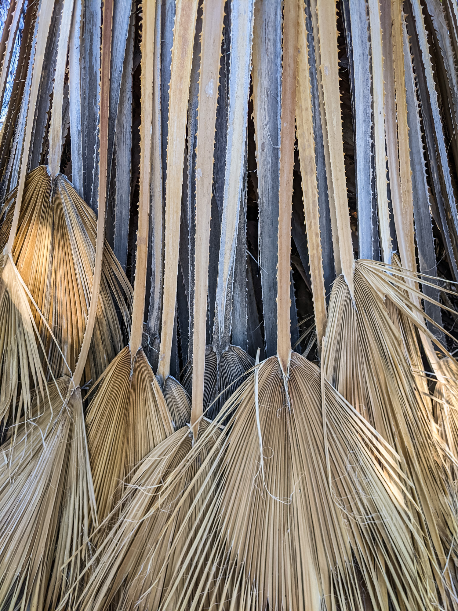
Our brains love rhythm. Just as music feels satisfying when it repeats, our eyes are drawn to repeating shapes, colours, and textures. A row of windows, a line of trees, even the texture of cracked mud – all of them create visual rhythm.
Filling the frame with a pattern transforms ordinary subjects into something mesmerizing. It’s order carved out of chaos.
Symmetry
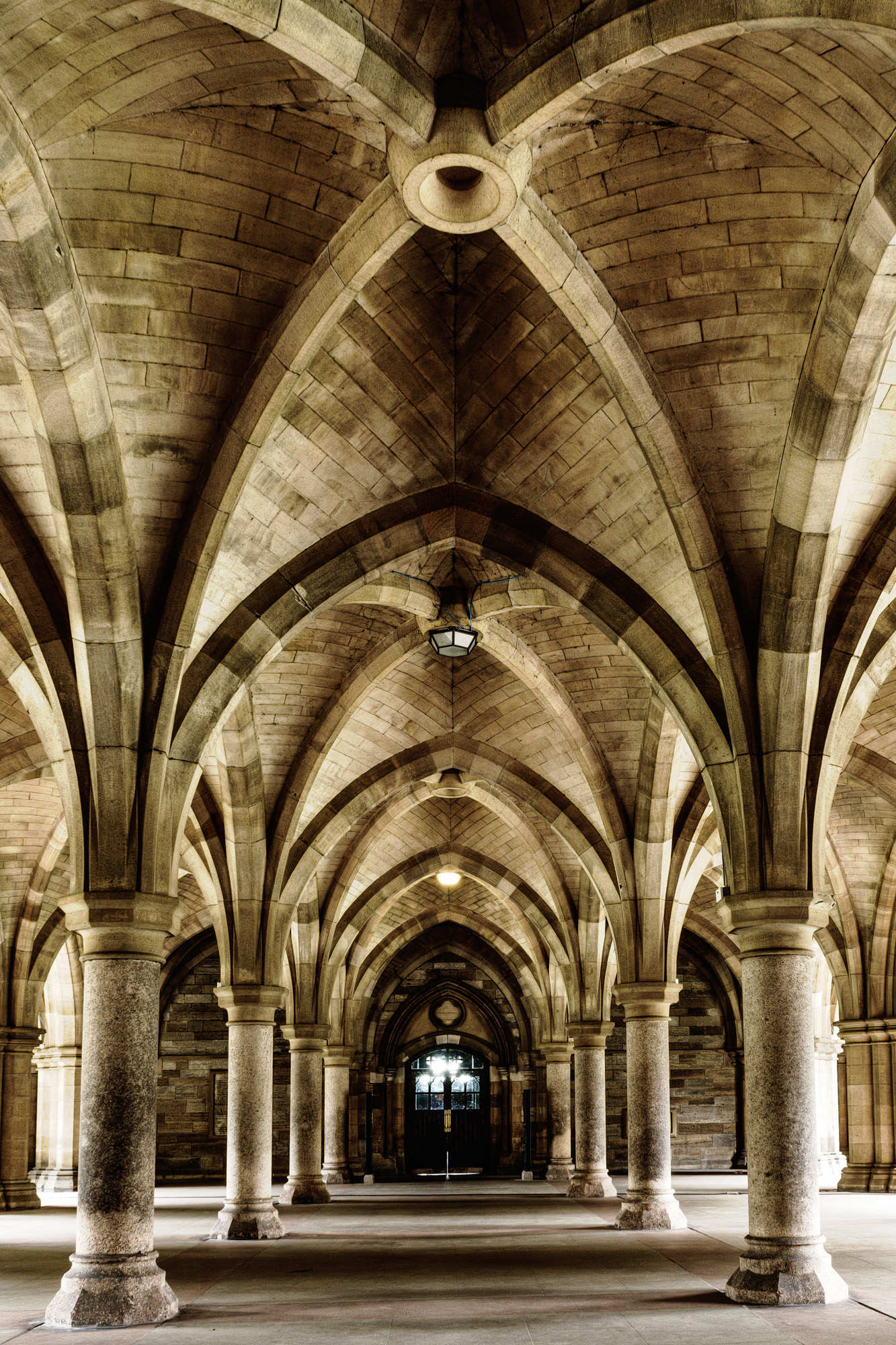
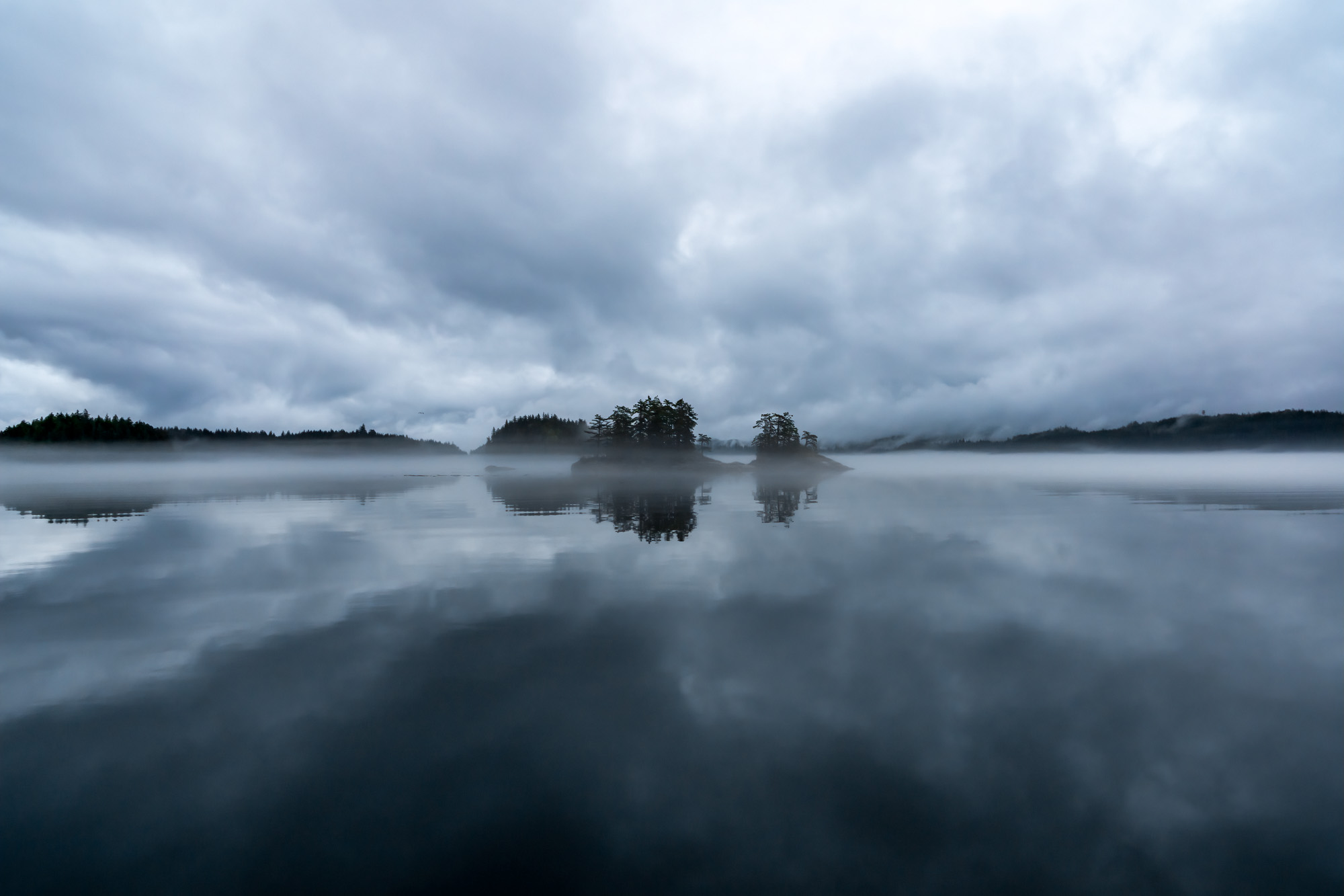
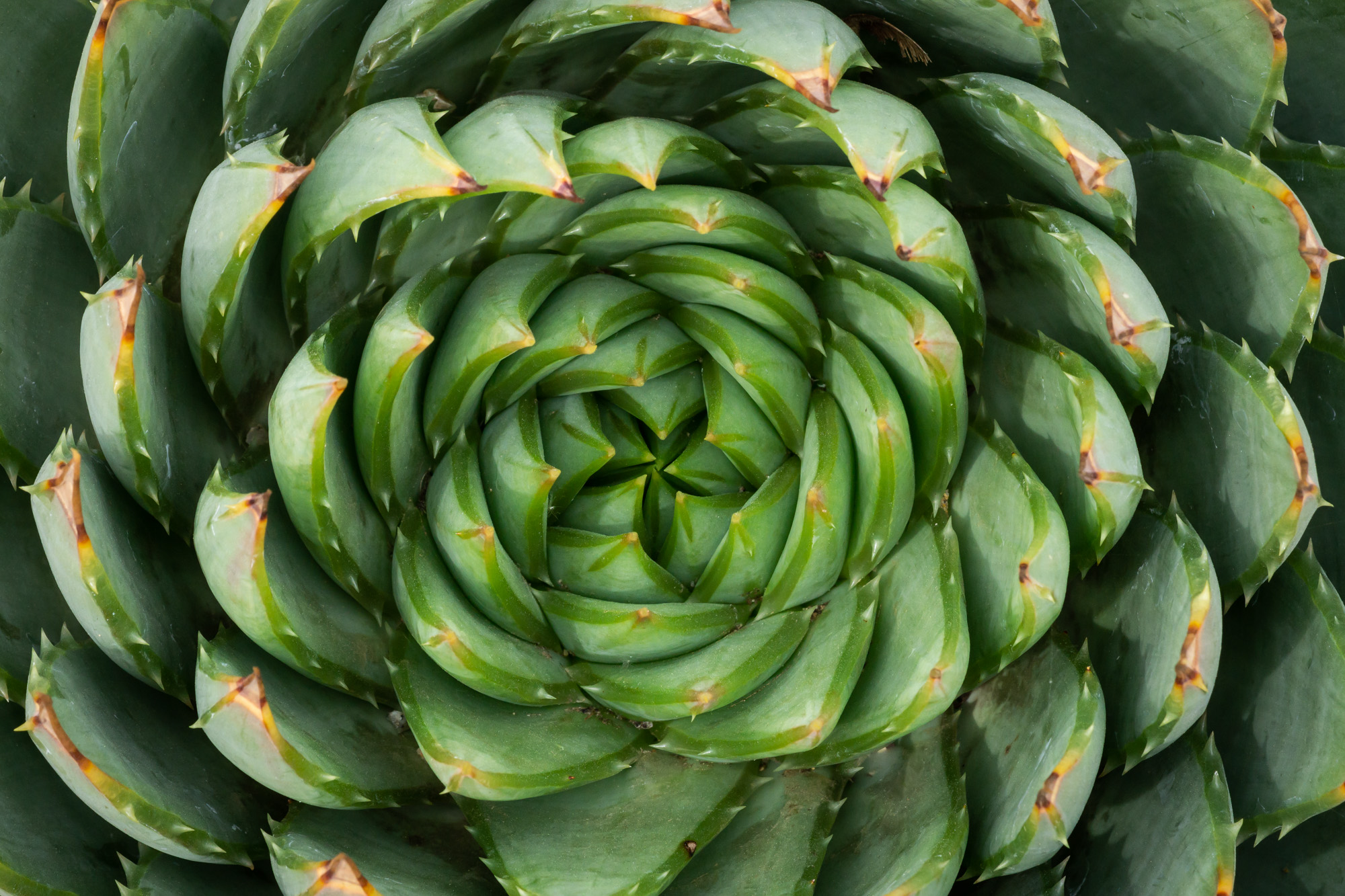
Photographers are often told to avoid putting their subject in the middle of the frame, to keep things dynamic and slightly off balance. And yet, symmetry has always carried a timeless appeal. When it’s done well, it can be breathtaking. The kind of composition that feels instantly harmonious and meditative.
In a symmetrical image, the subject usually sits right at center stage. The viewer’s eye naturally circles around the frame, returning again and again to the balance you’ve created. It’s calm, orderly, and feels deeply satisfying.
But here’s the challenge: symmetry only works when it’s exact. A photo that’s almost symmetrical tends to feel off, even dull. But when every detail lines up from corner to corner, background included, it can leave the viewer in awe.
That means photographing symmetry takes more care than you might think. It requires slowing down, really studying the scene, and being ruthless about what belongs in the frame and what doesn’t. Often it’s the tiny details, like the amount of space you leave on either edge of a doorway, that can make or break the effect. Careful use of the crop tool in post processing will help make it perfect.
The reward is worth it. Perfect symmetry has a way of transforming an ordinary subject into something quietly extraordinary.
Frame in Frame
Every photograph already begins with one frame: the edges of your image. Adding a second frame inside that boundary can transform your composition completely.
It’s a way of guiding the viewer’s eye deeper into the image by placing your subject inside another frame such as a doorway, an arch, a window, even the branches of a tree. It adds layers, draws the viewer in, and makes the photo feel dimensional.

Of course, not every scene offers this kind of opportunity. But the more you practice looking for them, the more often you’ll start to notice potential frames hiding in plain sight. A gazebo framing a garden, the opening between two rocks revealing the ocean, even a background that frames something in the foreground.
Adding this extra boundary can be a simple but powerful way to make your subject stand out and to draw your viewer deeper into the image.
This is one of my favourite techniques and it turned out to be the answer for my scene at the Kilchurn Castle. From where I stood, there was a random tree off to the side. I had been tempted to walk in front of it, to get it out of my way, until I realized from a slightly different angle, it would frame my beautiful castle.
Bringing It All Together
The next time you’re out with your camera, instead of rushing to snap the obvious shot, pause. Take a breath. Look for one of these design elements: a line, a colour contrast, a repeating pattern. Play with it. Let it guide your composition.
Because in the end, photography isn’t about capturing everything in front of you. It’s about noticing what matters, and arranging your frame so the viewer notices it too.
Once you start looking for design elements, you’ll see them everywhere.
That moment at Kilchurn Castle taught me this: the world will always feel chaotic at first glance. But when you learn to seek out the elements of design, you will find the hidden order in the chaos, and in that order, the impact you were looking for all along.
I recommend giving yourself an assignment: go out with your camera with the goal of finding just one of these elements of design. Don’t try to remember them all. Once you’ve done an outing for each of these, noticing them will start to feel like second nature.
And this is really just the beginning. There are more elements of design than the few I’ve shared here, each one another way of bringing intention and impact to your photographs. If you’d like to explore them further, I’ve gathered more lessons and examples in my ebooks, The Compelling Photograph Books 1 and 2.
I’d love to hear what this brought up for you especially if went out on a photo shoot looking for one of these elements of design. Did you find it?
Even a simple “thanks” or “me too” is always appreciated!

Wish your photos had more impact?
If you’re ready to move beyond snapshots and start making photographs that truly stand out, my eBooks The Compelling Photograph (Books 1 & 2) will help you get there.
These eBooks will help you understand the principles of good image design, exploring the elements of design along with creative techniques and composition ideas — all explained with clear lessons and plenty of visual examples, so you can start composing with intention and impact.
Some really important suggestions and ideas. Thank you. My main take away is this: ‘Because in the end, photography isn’t about capturing everything in front of you. It’s about noticing what matters, and arranging your frame so the viewer notices it too.’ While reading your blog I also tried to translate it to my macro/closeup photography. Do important to get it right. Thank you very much.
Thank you very much for the great feedback Chris. I think you extracted the one sentence that is the most important in photography, to notice what matters most. I appreciate your visit and comments!
This is very useful knowledge, I have both your E-books
So glad you found the tutorial helpful, thanks for letting me know Kapil!
Thanks so much for all the good advice. I just enjoy it more and more to take photos.
That’s awesome Maritha, photography is a wonderful way to stay connected with nature, be creative, and make things to share – I’m so glad the tutorials are helpful. Thanks for your visit and comments!
Good article. Thanks for the incentive.
You are welcome Nick, glad you enjoyed it!
Thank you very bigly about this brilliant lesson Anne I’m definitely going to start utilising these compositions on every day of my camera work until it becomes second nature to most of my photography journey!!!
Thanks Anne
Regards
Ben
You are most welcome Ben!
thank you for the inspiration Anne lovely photos
You are most welcome Jon, glad you enjoyed the post and photos!
Beautiful example photos in your post! I especially value how you explained the different effects of horizontal, vertical, diagonal, and curved lines, clear and insightful.
Thank you so much Kathy, I’m very glad to hear you found the tutorial helpful!
muito interessante. obrigado
You are welcome Joao, I’m glad you enjoyed the post, and I appreciate the kind words.
Thank you very much, Anne. I focussed too much on the rule of thirds. But now I realize (with your photos as proof) that other compositions may be allright also. Regards from Holland.
Hi Jaap, isn’t it funny how we get into habits? I know exactly what you mean, my camera feels like it has some kind of magnet that forces my composition into thirds. The other thing I do unconsciously is exclude man-made objects. And then I’ll see my husband’s snapshot and realize there were stairs or a railing or something that would have made an excellent composition. That’s why I like to go out on shoots with something in particular in mind – it kind of forces you to see it. Thanks for your visit and comments!
Thank you again.
You are a breath of fresh air.
Oh, what a kind thing to say, thank you so much Douglas, you made me smile.
“I used to be indecisive now in not sure” applies to me! I take photos with each of the lenses on my iPhone and different angles then rush off to the next think with ‘I’ll sort them out later”. Only I don’t and I buy ever larger hard disks. And I’ve just missed the dateline for our club photo contest this month. But thank you. I will now look at my photos and see if I unconsciously followed any of your advice.
Ah, yes, that sounds familiar, I used to do that too. It wasn’t until I starting thinking about the elements of design while on the scene that my images started to have real impact. I remember one scene in particular when it really clicked (haha pun). I was photographing a house on the beach and I had leading lines in the back of my head for my mission for the day. I didn’t see any. But there were some logs. So I walked around until I found a way to make the logs point the house and what a difference!
In my landscape photography, I’ve changed my mindset and my lens from a 24 mm perspective to a 105 mm perspective.
haha, that is so funny Paul because I feel like I did the opposite thing. When I first started I was all about long lens landscapes, filling the frame with things, and using compression. It took me a while to learn how to put things in the foreground and create depth with a wider lens. Hmm… that sounds like a good blog post!
That is very interesting. Food for thought and discussion. Wide angle or telephoto? For me the wide angle makes the distant objects too small and they get lost.
Yes, that is true, but it can also make things close to you look really big. I love a wide angle for flowers. Seascapes too. It did take me awhile to get used to it though but it opened up a whole new way of seeing things.
Thank you for these great points, Anne. I’ve been taking a composition course with an oil painter, and we’ve practiced something similar, just with pencil and brush instead!
Oh interesting! Well that makes sense that the principles of composition would be the same in various visual art forms. Just the implementation is different because painters start with a blank canvas and add things whereas photographers start with a busy scene and exclude things. I appreciate your comments Helen, thanks.
Very well written and excellent information. I know I do some of these things with out even thinking about it; buts it’s good to read it and bring it to my/our attention . Your example photos are excellent! A sincere thank you.
You are welcome Herb and I thank you for the wonderful feedback. I was just thinking I should take my own advice and go on a shoot with just one of these things in mind because it’s amazing how differently we see the world when we are looking for something in particular. It’s like the red car phenomenon
Yes; you are 110% correct. Currently we’re in the North Cascades in our Rv for 4 weeks. I’m going to try real hard to concentrate on just a couple of these items.
Thank you very much Anne. You have given me a thoughtful way to structure the complexity my eyes see.
You are welcome Astrida! Making sense of the chaos of our surroundings and focusing on what is important is the key. Thanks for your visit and comments.
Well put. Deciding what not include was a lesson i learned some time ago. Works well when applied. Thanks for your insights, well worth the read!
Thank you CW, I’m glad the lesson resonated with your own experience and I really appreciate your comments.
Great lesson and i love your examples! Thanks for sharing.
You are most welcome Lulu, glad you enjoyed it! I appreciate your kind feedback.